Cart (0)
Your cart is empty.
July 22, 2026
By Brian G
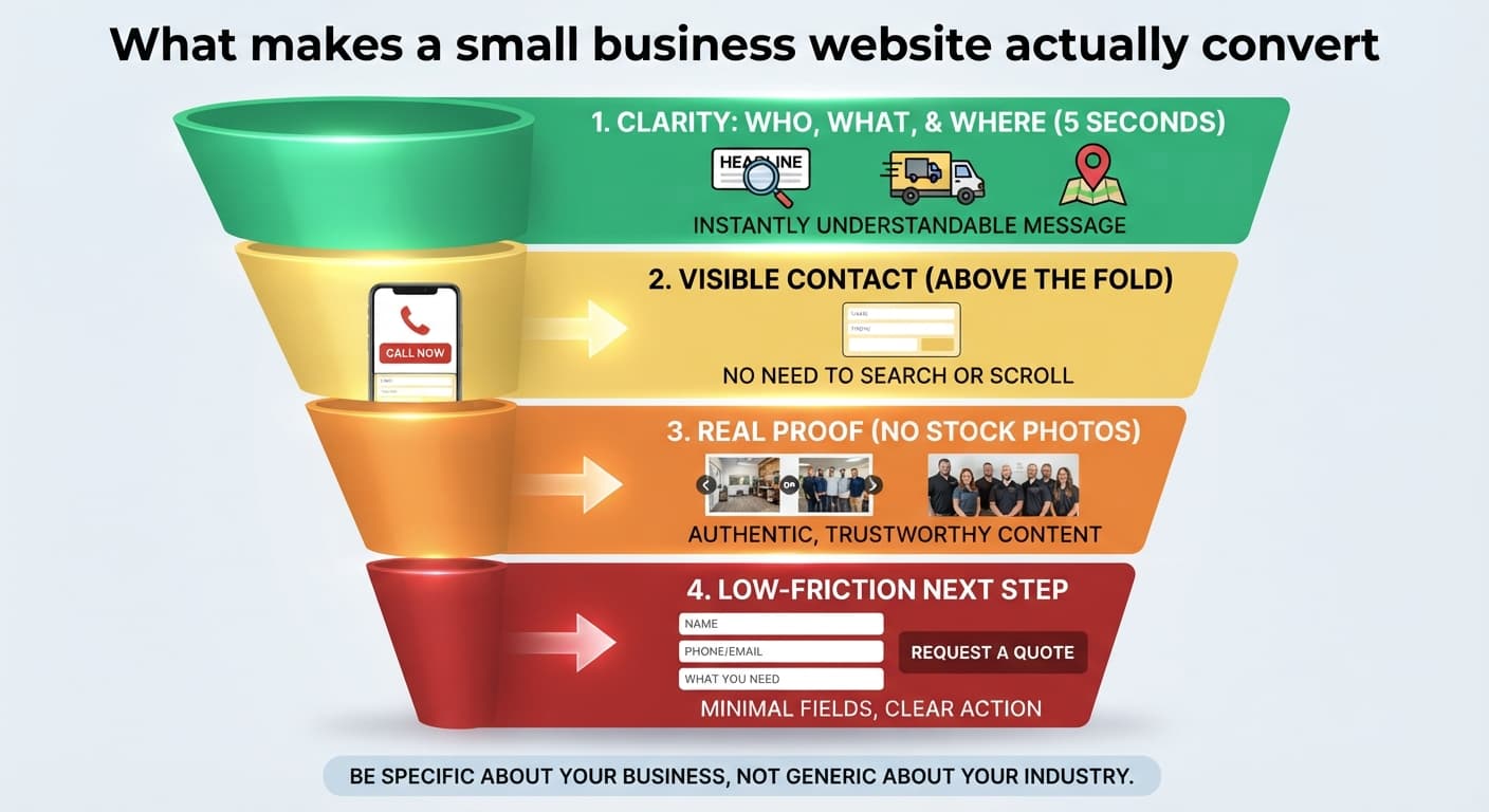
Business owners tend to worry about the wrong things first — logo size, whether the blue is 'too blue,' font choices. Those matter at the margins. They almost never explain why one website converts visitors into calls and another doesn't.
What actually moves the needle: a visitor being able to tell within five seconds what you do and where you do it; a phone number or contact form that's visible without scrolling; real photos or work examples instead of generic stock imagery; and a page that loads fast on a phone on a mediocre connection, since that's how most local searches happen.
The single biggest silent killer we see on existing small business sites is unclear service area. If someone in a nearby town can't tell within a few seconds whether you serve them, they leave and call the next result instead.
A simple test you can run yourself: have someone unfamiliar with your business look at your homepage for five seconds, then look away and tell you what you do and where you're located. If they can't, that's the fix to prioritize — before new photos, new colors, or new features.
Second-highest priority after clarity: making the next step obvious. A phone number in the header, a 'Request a quote' button that's actually visible, and a contact form that asks for the minimum information needed to follow up — name, contact info, and what they need. Every extra required field is a small reason for someone to leave instead.
None of this requires a redesign trend or a bigger budget — it requires being specific about your business instead of generic about your industry. That's most of what a good discovery call is actually for.