Cart (0)
Your cart is empty.
July 22, 2026
By Brian G
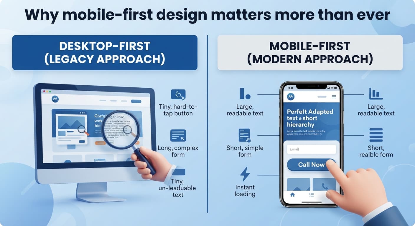
Mobile-first design means exactly what it sounds like: designing for the phone screen first, then adapting up to larger screens — not the reverse. For most home service businesses, the majority of visitors are now finding you from a phone, often while standing outside, in a car, or between other tasks.
The practical implications: text needs to be readable without zooming, buttons need to be large enough to tap accurately with a thumb, forms need to be short enough to fill out on a phone keyboard without frustration, and pages need to load quickly on a mobile connection, not just office wifi.
A quick self-test: pull up your own site on your phone, ideally on cellular data rather than wifi, and try to complete the exact action you want a customer to take — call, request a quote, check your hours. If any part of that is awkward, slow, or requires pinching to zoom, that's costing you real customers.
This isn't a one-time fix and forget — as phones and browsers update, it's worth re-checking your site on mobile every few months, the same way you'd periodically check that your hours and contact info are current.
If you're evaluating a new website build, ask directly whether it's being designed mobile-first or whether mobile is an adaptation of a desktop design after the fact — the two produce noticeably different results.